Shannon Retail Park, Dublin Rd, Athlone, Co. Westmeath, N37 E2P6
info@zinkworks.com

Building Visual Dashboards in the Cloud

Big data is revolutionising how businesses operate, transforming decision-making processes across industries. Cloud technology has emerged as the catalyst to empower organisations, regardless of size, to effortlessly manage vast volumes of data. This technological advancement not only slashes the maintenance overheads linked to massive datasets but removes the necessity of recruiting and training specialised IT professionals. Even when dealing with large amounts of data, businesses can leverage cloud platforms' scalable computational and analytical capabilities to create engaging dashboards and uncover valuable new insights. Let's explore the challenges and steps we need to consider when dealing with large data and machine learning models.
Aggregating Big Data for Dashboards
As datasets are becoming increasingly complex and challenging to understand, it has become vital for decision-makers to rely on data visualisation as a means of simplifying and interpreting large amounts of valuable information. Utilising this data, businesses can effectively understand difficult concepts, identify emerging patterns, and gain data-driven insights to make informed decisions.
For instance, BigQuery is a serverless and cost-effective enterprise data warehouse that works across clouds and scales with your data. Use built-in ML/AI and BI for insights at scale. Once the data resides in BigQuery, SQL queries come to the rescue; you can perform data analysis and get insights from all your business data. This allows companies to make decisions in real-time, streamline business reporting, and incorporate machine learning into data analysis to predict future business opportunities.
Applying Insights through Visual Best Practices
Now having aggregated data sets, it’s time to focus on effective and intuitive visualisations. Visual best practices are key to developing informative visualisations that drive the audience to act. Here are some of the best practices for data visualisation.
- Know your audience and purpose: The best dashboards are built with their intended audience in mind. Ask the question, “Who am I designing this for?” and continue to check that the dashboard supports their business goals and encourages exploration.
- Consider display size: Where will the audience be viewing the dashboard the most? Desktop or mobile? Do some research upfront to inform your design and adjust accordingly for the best experience.
- Plan for fast load times: Optimise dashboards for faster load times, which can contribute to better engagement.
- Leverage the sweet spot: Always consider how your audience will “read” the dashboard. The dashboard should have a sensible “flow” and a logical layout of different pieces of information.
- Limit the number of views and colours: Consider using colour only if it enhances the analysis. Sometimes, too many colours can slow or even prevent analysis.
- Select useful information only: Do not overload the user with too much information. It is important to pick only data that will be useful and raise interest to the reader. Simplicity brings clarity.
- Add interactivity to encourage exploration: The power of dashboards lies in the author’s ability to queue up specific views for side-by-side analysis. Filters supercharge that analysis and engage your audience.
- Test the dashboard for usability: An important element of dashboard design is user testing. After building a prototype, ask your audience how they use the dashboard and if it helps them answer their pressing questions.
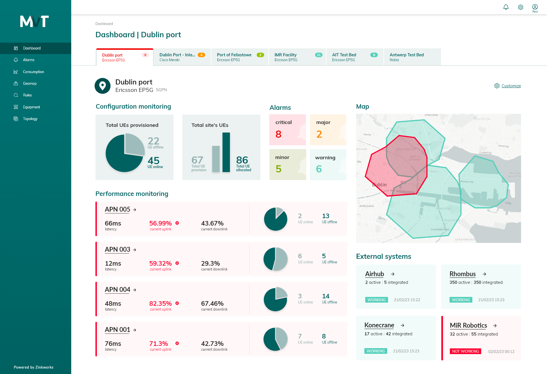
An example of a visual dashboard created by Zinkworks:
Scalable Performance on the Cloud
Scalability is an issue in data analytics, hosting your dashboards on a cloud platform ensures scalability and responsive user interfaces, even under heavy loads. Serverless platforms like Google Cloud Run can instantly scale dashboards to accommodate thousands of users with configured autoscaling.
Content Delivery Networks (CDNs) play a vital role in optimising dashboard delivery. By caching dashboard images and data close to users, CDNs enhance the user experience. Additionally, integrations with cloud monitoring tools enable you to track dashboard usage patterns and performance, helping you identify and address potential bottlenecks promptly.
Conclusion
Harnessing the scale, flexibility, and integrations offered by cloud platforms, organisations can effectively navigate the complexities of large datasets and deliver valuable insights rapidly through visual dashboards. With the right combination of data warehousing, analytics, and hosting, the cloud serves as the indispensable foundation for businesses seeking to thrive in the era of data-driven decision-making.
If you would like to learn more about building dynamic cloud-based visual dashboards, please contact our Zinkworks team by emailing: marketing@zinkworks.com
Written By: Mahdi Khosravi & Sharmistha Sodhi